
Underlying basics to candlestick patterns
So you want to learn about candlestick patterns to help with your trading? You think you have to learn all the different types and names right? Well relax ... you don't have too.
There are plenty of candle trading patterns. Here are their names;
The white candle, the black candle, shooting star, hammer,
inverted hammer, hanging man, doji, spinning top, marubozu or shaven
candle, short candle, long and dominant candle, bearish rejection,
bullish rejection, bearish engulfing pattern, bullish engulfing pattern,
dark cloud cover, piercing pattern, harami, harami cross, evening star,
morning star, evening doji star, morning doji star, two crows, upside
tasuki gap, downside tasuki gap, rising three method, falling three
method, tweezer top, tweezer bottom, upthrusts, springs, dominant white
candle, dominant black candle, ... plus others.
If you are interested in looking at these different patterns, Wikipedia shows all the simple and complex candlestick patterns http://en.wikipedia.org/wiki/Candlestick_pattern or go here.
To the uninitiated newcomer wanting to learn candlestick patterns
it may seem a little daunting. Some candlestick trading patterns are
known under different names, while others have been invented in more
modern times.
Learn about the basics of candle charts here.
These trading candle patterns seem to have their roots in the
orient, namely Japan. The concept was developed by rice traders back in
1500 to 1600 time period.
It is important to realize that these candlestick patterns are only guidelines. They are not 100% accurate, nor is anything else out there one hundred percent reliable. Remember, that these patterns simply move the odds in the traders favor.
The idea is to understand the psychology behind the price action.
Add this psychological understanding to your current trading system and you will see dramatic improvements to your profit.
The questions traders should ask themselves while using candlesticks are; "Why is this price pattern forming? What is it indicating? Does it show hungry keen buyers desperate to go long? Or does this price pattern show scared sellers desperate to exit their positions or desperate to go short? Or Does the formation of this pattern show indecision?" Let's take a look at the chart below ...
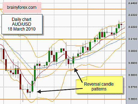
The above chart shows the Australian Dollar daily chart 18 March 2010.
Notice how in both cases (shown by the arrows), we first see big
red bearish downward price action, followed by smaller price range days
(no color) and then followed by Big green candles.
To restate we see, price on the daily bars go from closing the
day down ... to closing the day unchanged ... to closing the day higher
than opening. ie BIG RED, NO COLOR, BIG GREEN.
If price starts high in the day and finishes low at the end of
the day we can expect the same for the next day. This is because price
is being pushed downwards and who knows how long this will continue for?
Another day? Another two days? Another three days? Nobody really knows.
We can call this a bearish red (or black) candle. The more volume
(sellers) the more powerful).
The same principle holds true for price starting low at the
beginning of the day and then finishing the end of the day on its
highest point. This is a bullish white candle. We can expect more
bullish days to follow. But who knows for how much longer?
We can see that once these bullish or bearish daily candles start
weakening we can expect price to stall or retrace a little or retrace
fully depending on other factors.
Read more about the correct way to read a candle chart, go here.
Candlestick patterns work best when market trending
When the market is in a sideways pattern, bullish and bearish
candlestick patterns may not mean anything. The power in candlesticks is
when price is trending.
Use them on any time frame
Don't forget to use candlestick patterns on every or any time
frame. We can see what pattern price set based on yearly charts,
quarterly, monthly, weekly, daily, 4hr, 1hr, 15 minute, 5 minute etc
time frame. It is a good idea to check the candle patterns on the higher
time frames so as to confirm you are trading in the trends dominant
direction.
It's interesting to note that when Steve Nison started translating candlestick chart information from Japanese books he noted that most of the chart illustrations were shown on the "WEEKLY charts". Trading legend WD Gann encouraged trading speculators to use the 'weekly chart' as a major reference point as he believed that they were the most accurate. Read more about WD Gann here.
Orange lines on chart
Wondering what the orange horizontal lines represent on the above chart? They are 'secret' support and resistance levels that not that many traders know about. They are natural square levels. Read more here.
Brainyforex Newsletter [SUBSCRIBE HERE]
Brainyforex Tip - EA's to watch;
Automic Trader Click here. (Affiliate link)
King Robot Click here. (Affiliate link)
(NB : Affiliate commissions help assist running costs of brainyforex.com without any extra cost for purchaser).
Need software to test and improve your trading strategy? We have special coupon discount codes here.
Recent Articles
-
Forex Advertising is available on brainyforex.com | Forex ads
Aug 22, 23 12:41 AM
 Forex Advertising for your trading product, service or brokerage firm. Buy banner space at the lowest prices on the net for forex trading traffic.
 -
Forex Trading Systems Solutions. Tell Us.. We Listen! Everything Forex
Feb 22, 23 07:36 PM
 Don't become a victim of guru forex trading systems, forex software, forex robots or signals that don't work. Learn through articles and traders reviews & feeeback.
 -
I am a very successful trader because of his course
Jan 12, 23 10:52 PM
Five Star. Took Todd Mitchell's day trading course back in 2008 and spent 1000.00. I am a very successful trader because of his course. The course is


