Candlestick chart better than bar chart
It is true that the Japanese candlestick chart is far superior to the western OHLC (open, high, low, close) bar chart. They both contain the same information, however the candle chart helps traders see the relevance of the price action with greater ease.
Take a look at the two charts below. With the candlestick chart on the left see how the price action jumps out at you! The chart is easier to read because the green candles show when the buyers (bulls) are stronger than the sellers (bears) and the red candles show when the sellers (or those going short) are dominating the buyers (those going long).
 Candlestick chart vs bar chart comparison
Before getting bogged down in learning about the specifics of candlesticks, it is useful to remember the underlying basics behind them. Read more here.
Would you like to know three things that are essential to being able to read candlestick charts correctly? This information is presented here.
Different candlestick patterns can be found here.
Wikipedia shows all the simple and complex candlestick patterns http://en.wikipedia.org/wiki/Candlestick_pattern
Basic candlestick construction
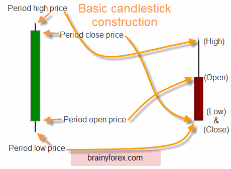
As noted on the above illustration of the two price candles, we notice that there are always four variables involved.
There is always the 'opening price' for the period, the 'high price', the 'low price' and finally the 'closing price'.
If price closes higher than it opened, the candle is green. (or white depending on your charting service).
If price closes lower than it opened, the candle is red. (or black depending on your charting service).
If price closes on the same level it opened, the candle does not have a color.
The idea behind these colors is to show instantly whether price
action is either bullish or bearish. Who is winning, the bulls or the
bears for that period!
All time frames
It is interesting to note that these candles can be used on any time frame. Scalpers using second or minute bars can benefit as well as long term investors whom hold positions for years.
Components of candlesticks
The components of the actual candle can be summarized in seven elements.
1) Color. As mentioned above, the color of the candle has major
implications as to whom is winning the battle between the bulls and the
bears. A general overview of the chart in regard to how many green
candles and red candles are present give us a starting point.
2) Candle range. As with bar charts, consider the peak of the top of the candle (top of shadow) and also the bottom.
3) Candle body size. As seen from the chart above, notice the big
green candle compared to the not so large red candle. This shows that
there is greater bullishness with the buyers compared to the smaller red
candle signifying sellers. If the candle has no body (no color) this
means indecision by the buyers and sellers.
4) Shadow location. If we consider the red candle in our
illustration above, we notice that when price reached the top of the
period range (the high), sellers moved in and forced the close price
down to the bottom. We take note of this selling pressure at the top of
this candle. This is extremely important near the top of prior trading
ranges. The same rules apply in reverse for a green candle at the bottom
of a trading range.
5) Shadow size. The longer the shadow size the greater the rejection by the buyers or sellers.
6) Combination of candles. We can combine several candles on
shorter time frames together to create one candle. Simply follow the
rules based on open, low, high and close to create a larger time frame
candle.
7) Candle location. It is essential to consider prior price action / candles before assuming what a candle is telling us. Has price been trending? Has price been moving in a side ways pattern? Has a double top or bottom appeared? What about a lower high or higher low? To become a candlestick chart master, it is essential to understand these things.
If you want to keep learning for free, visit tradingview's candlestick chart educational materials here https://www.tradingview.com/chart/XAUUSD/jpkQu2xk-Understanding-Candlestick-Patterns/
BrainyForex articles examine a range of forex‑related topics through research and analysis rather than promotion.
Recent Articles
-
Exposure Escalation in Martingale Trading Systems | BrainyForex
Feb 12, 26 01:06 AM
An examination of how martingale trading systems escalate risk exposure over time, explaining why losses tend to accumulate suddenly rather than gradually. -
Timeframe Sensitivity in Automated Trend Following | BrainyForex
Feb 11, 26 11:35 PM
An examination of how timeframe selection influences automated trend following behaviour, focusing on structural differences rather than performance outcomes. -
Trend Following Automation Across Market Conditions
Feb 11, 26 10:20 PM
An exploratory examination of how a simple trend following automation approach behaves under different market conditions using structured testing.
Top 3 Prop Firms — Get Funded to Trade
FundedNext - Up to 95% performance reward Learn more.
SabioTrade - Keep up to 95% of trading profits Learn more.
FTMO - Keep up to 90% of trading profits Learn more.
Using these affiliate links helps support BrainyForex.com at no extra cost to you.


